
In the age of retina-themed CMS’s, markdown, and website builders there is absolutely no excuse for a poorly designed website.
Government agencies are the worst offenders of user interface design. Recently I browsed through about 30 US State Department websites to see first hand at how awful these sites are, and took some notes along the way.
User interface design is truly an art. The goal of a “good user interface” is to make the navigation of a website (or app, device, blender, etc) as simple and intuitive as possible. Common blunders such as improperly labeled menus, using too many fonts, and poorly optimized images can completely ruin an experience for a user.
Here are 8 of the most menacing user experience errors that I ran across during my audit of US State Department websites.
Confusing & Improperly Labeled Menus
I first learned about “naming conventions” back in MS-DOS when I learned about naming files. I later learned about naming conventions again in the NAVY when I learned about the naming conventions of email addresses.
Website menus are no different. Sure it is OK to mix things up a little bit every now and again, but overall it is a good idea to stick to menu labels that are familiar to the user.
Why? You don’t want your user fumbling around your website looking for what they need. Especially on a government website.
Figure 1: Confusing labels. These labels are not only small but are difficult to navigate and read. The menu pops down below the primary menu and spans the entire length of the page. It takes extreme precision to click and is very difficult to focus on.
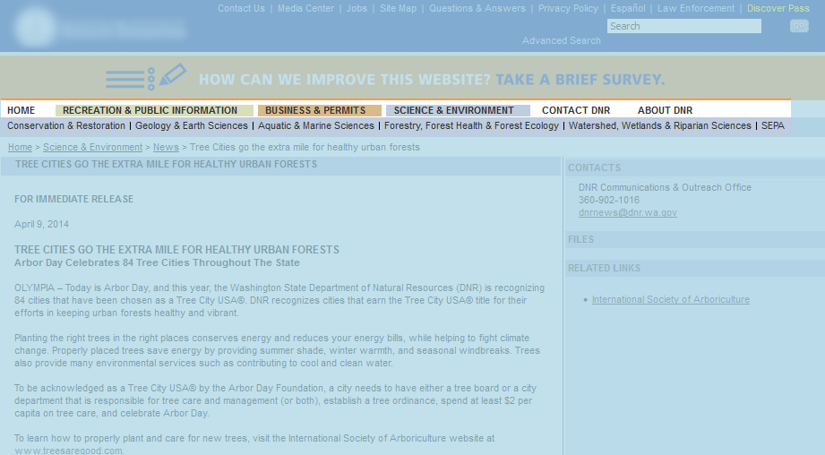
Figure 1: Confusing Labels
Figure 2: Unfamiliar Naming Conventions – Out of all the examples, this one is the biggest offender to me. I wouldn’t even know where to start looking at these menus. Sure, I “get” what they were trying to do, kind of. But not really. Stick to menu labels that your users are familiar with such as “Home, About, Contact, Services” to avoid having them leave your site.
Figure 2: Unfamiliar Naming Conventions
Figure 3: Tiny Menus and Clickable Areas – In this day in age, 14px is really the minimum any menu or label should be. Sure there are some exceptions such as microcopy where a smaller font is acceptable, but in general your text should be big enough for anyone to read.

Figure 3: Tiny Menus and Clickable Areas
Huge Forms & Forms with Small Fields
In many instances, website forms are the bridge between you and your customer. Great thought is put into the design and implementation of some of the big brands’ forms. Forms with dozens of unnecessary fields frustrate users and may cause them to “do this some other time” aka leave. Forms with tiny fields and labels make it tedious for users to fill out, which will also cause high amounts of frustration.
Figure 4: A form with tiny fields and labels – Forms with large fields aren’t just a trend, it is proven that forms with larger fields are more inviting for the user. There is something about a large form with a nice design that just says “fill me out.”

Figure 4: A form with tiny fields and labels
Figure 5: Form with too many fields – Try to limit the amount of fields on your forms. In this case there are a ton of redundant fields. If you know the City and State you also know the Zip and County. Do you really need 3 phone numbers. There are some cases when you do need to create large forms, there is just no getting around that. In these cases it is best to split up these forms into multiple pages or sections as to not overwhelm the user.

Figure 5: Form with too many fields
Walls of Text
Web usability studies have concluded that the optimal amount of characters per line is about 50-60. Reading on the web is much different than in a book or a newspaper.
Figure 6: A Wall of Text – This government website has a lot of information, but it could be more optimally displayed with a larger font, less characters per line, and a better layout.
Figure 6: Walls of Text
Too Many Font Sizes
Typography is an art, and an entire industry. I could talk for days about type, kerning, spacing, contrast, color, etc. One of the most common UI blunders that designers make is using too many font sizes. A rule of thumb I like to go by is to use no more than 3 sizes per page.
SEO’s are huge offenders of this. Lot’s of SEO’s have been trained to use “lots of HX” tags so you will commonly see an H1, H2, H3, H4 and body text all within the same page.
The name of the game is balance, consistency and symmetry. Having too many font sizes makes it difficult for the user to figure out what is important and what is not.
Figure 7 – This website has at least 6 different font sizes in one small section. Cut that in half for a much more consistent look.

Figure 7: too many font sizes
Too Much or Too Little Whitespace
There is a fine line between too much and too little whitespace. Having a sufficient amount of whitespace on your homepage can add to the overall attractiveness of your website. It can also aid in directing the attention of your user to the region you want them to focus on. The homepage of a government website is critical real estate. Having too much whitespace can be a wasted opportunity.
Figure 8: 80% or more of this government website is whitespace. A call to action in the center of the page or a list of services could help users find what they are looking for much easier.
Figure 8: Too much whitespace
Too Many Links
Options are good, but too many options can overwhelm your user and cause confusion. A good suggestion for a site with too many links is to find a way to consolidate and categorize them.
This happens a lot of the time to websites that haven’t had an overhaul in a long time. Agencies add content and links to the website without regard to the usability of it and before you know it you have a huge wall of links.
Figure 9: This website has far too many links on the homepage. 60% or more of this homepage is links.

Figure 9: Far too many links on this homepage.
Some of these might seem like not a big deal, but small problems add up to equal major issues. A website is a constant work in progress. Test, test test.
Thank you so much for reading this post, if you enjoyed it please share it on your social network of choice. Thanks! :-)


